Building a fully responsive website in Webflow means your site looks and works perfectly across desktop, tablet, and mobile—without writing custom code. This step-by-step guide walks you through a proven workflow used by designers and agencies to create scalable, SEO-friendly Webflow websites.

Before styling anything, focus on layout structure:
A clean structure ensures responsive behavior stays predictable across breakpoints.
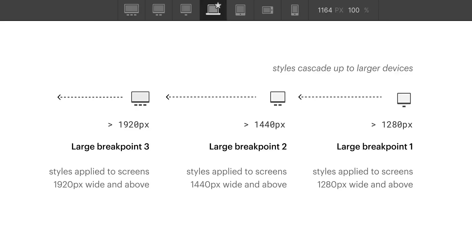
Webflow uses a desktop-first approach, so your desktop layout sets the foundation.
Best practices:
Think in terms of flexible systems, not static designs.
To build responsive layouts in Webflow without custom code:
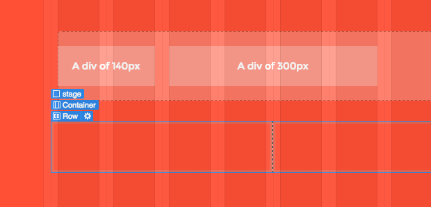
Both tools adapt naturally to screen size changes and are essential for responsive design.
Once the desktop layout is ready:
Repeat the process for Mobile Landscape and Mobile Portrait.
Always design mobile intentionally—don’t rely on inheritance alone.
Typography plays a major role in usability.
Recommended practices:
Good responsive typography improves both UX and SEO.
Images often cause mobile issues.
Make sure to:
This prevents horizontal scrolling and layout breaks.
Always test your design with:
Responsive issues often appear only when real content is added.
Before publishing:
A final review saves hours of fixes later.
After publishing, monitor:
Responsive design is not a one-time task—it evolves with content.
As your site grows, revisit breakpoints and layouts regularly. Small adjustments over time keep your Webflow site polished and professional.
Learning how to build a fully responsive website in Webflow is about systems, not shortcuts. With the right structure, layout tools, and breakpoint strategy, you can create high-quality responsive websites without writing code.


.svg)
.svg)
.svg)