Accessibility is more than a design requirement — it’s a commitment to making the web usable for everyone. An accessible website ensures that people with visual, auditory, or motor impairments can navigate, read, and interact with your content easily. In Webflow, accessibility starts with design decisions: color contrast, keyboard navigation, and proper semantic structure. But building accessibly isn’t enough — you must test and verify that everything works as intended. This guide walks you through how to test accessibility in Webflow, which tools to use, and what best practices help you create an inclusive digital experience.

Accessibility isn’t just an ethical consideration — it’s also a legal and SEO advantage.
Testing validates that your visual design, code structure, and interactions actually support users with different abilities and technologies (screen readers, voice control, or keyboard navigation).
Webflow includes a few native tools that make early accessibility checks easy:
Before using third-party tools, review the Audit Panel after designing each page. Fixing early issues saves time later in the process.
A truly accessible website must work without a mouse.
If something can’t be reached by Tab, it’s not accessible to everyone.
Color contrast ensures readability for users with visual impairments or color blindness.
Pro tip: Avoid relying solely on color to convey meaning (e.g., “errors in red”); use icons or text labels too.
Screen readers like NVDA (Windows) or VoiceOver (Mac) read your site aloud for blind users.
H1 → H2 → H3)Good structure and clear naming improve comprehension for assistive technologies.
Webflow automatically outputs clean HTML, but designers still need to structure content correctly.
Checklist:
<ul>, <ol>) for grouped items.You can inspect these using Chrome DevTools → Elements panel or browser extensions like Axe DevTools.
Manual checks are vital, but automated tools speed up audits:
Use these after publishing your Webflow site to confirm compliance with WCAG 2.1 AA standards.
Animations and interactions enhance storytelling, but for users with motion sensitivity, they can be overwhelming.
To test:
prefers-reduced-motion media query.If necessary, create a simplified variant of your animation for reduced-motion users.
No automated tool replaces real user feedback. Invite users with different abilities to test your site.
Ask them:
User testing helps you identify issues that might not show up in an audit report.
Accessibility is ongoing, not one-time. Create an internal checklist in tools like Notion, Airtable, or mytask.id to track fixes and new updates.
Include:
This documentation ensures your design team maintains consistent accessibility standards across every project.
Testing accessibility in Webflow ensures your site is usable, compliant, and future-ready. From keyboard navigation and color contrast to screen reader testing and reduced motion, each improvement makes your design more inclusive.
Remember: accessibility doesn’t limit creativity — it amplifies it. Designing for everyone leads to cleaner structure, better SEO, and stronger brand credibility.
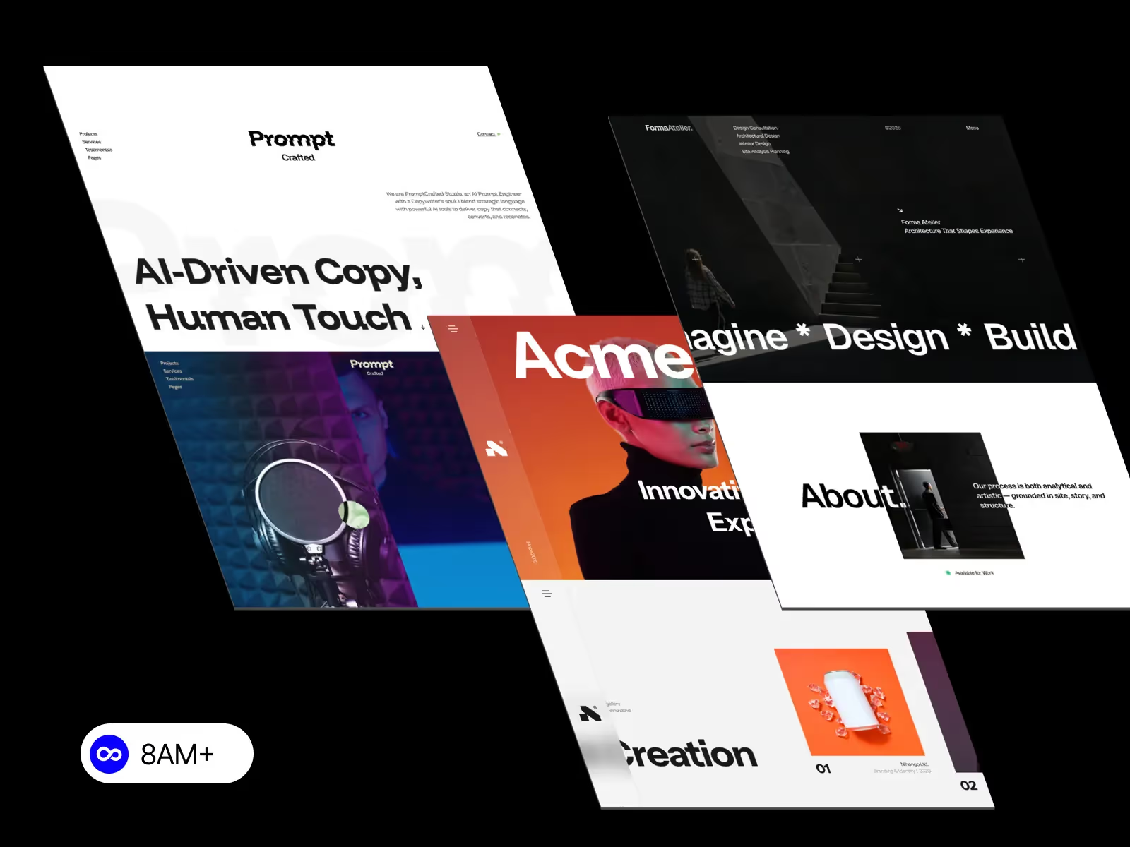
Explore accessibility-ready Webflow templates at 8am.design — crafted for creative teams that care about performance, inclusivity, and scalability.

