In today’s mobile-first world, responsive design is no longer optional — it’s essential. Whether you’re creating a portfolio, business site, or landing page, your website must look and function perfectly across all devices. The good news? Webflow makes responsive design easier than ever. In this guide, you’ll learn how to build, adjust, and perfect a responsive website using Webflow — without writing a single line of code.

Responsive design ensures your website automatically adapts to different screen sizes — from large desktops to small smartphones.
A well-designed responsive site:
With Webflow, you can visually preview and adjust your design across multiple breakpoints, ensuring every element fits perfectly.
Here’s why responsiveness is a big deal:
💡 Tip: Always test your design on real devices in addition to Webflow’s preview mode.
Webflow provides a device-based design system with built-in breakpoints:
You can adjust spacing, font size, and layout individually for each breakpoint. Changes automatically cascade down — meaning edits made for desktop will apply to smaller screens unless you override them.
Use Flexbox or Grid in Webflow to create flexible layouts.
Avoid fixed pixel widths — instead, use percentages or viewport units for responsive scaling.
In the Style Panel, use:
em or % for spacingvh/vw for height and widthauto for images and blocksThis helps your design adjust naturally across screen sizes.
Smaller screens need smaller text. Use Webflow’s responsive typography to set scalable font sizes per breakpoint.
Use Webflow’s responsive image feature — it automatically generates multiple image sizes for faster mobile loading.
Switch between Tablet, Mobile Landscape, and Mobile Portrait in the Webflow Designer to fine-tune margins, padding, and stacking order.
Even experienced designers make responsive design errors. Watch out for:
💡 Pro Tip: Use the Navigator panel to keep your element hierarchy clean and organized.
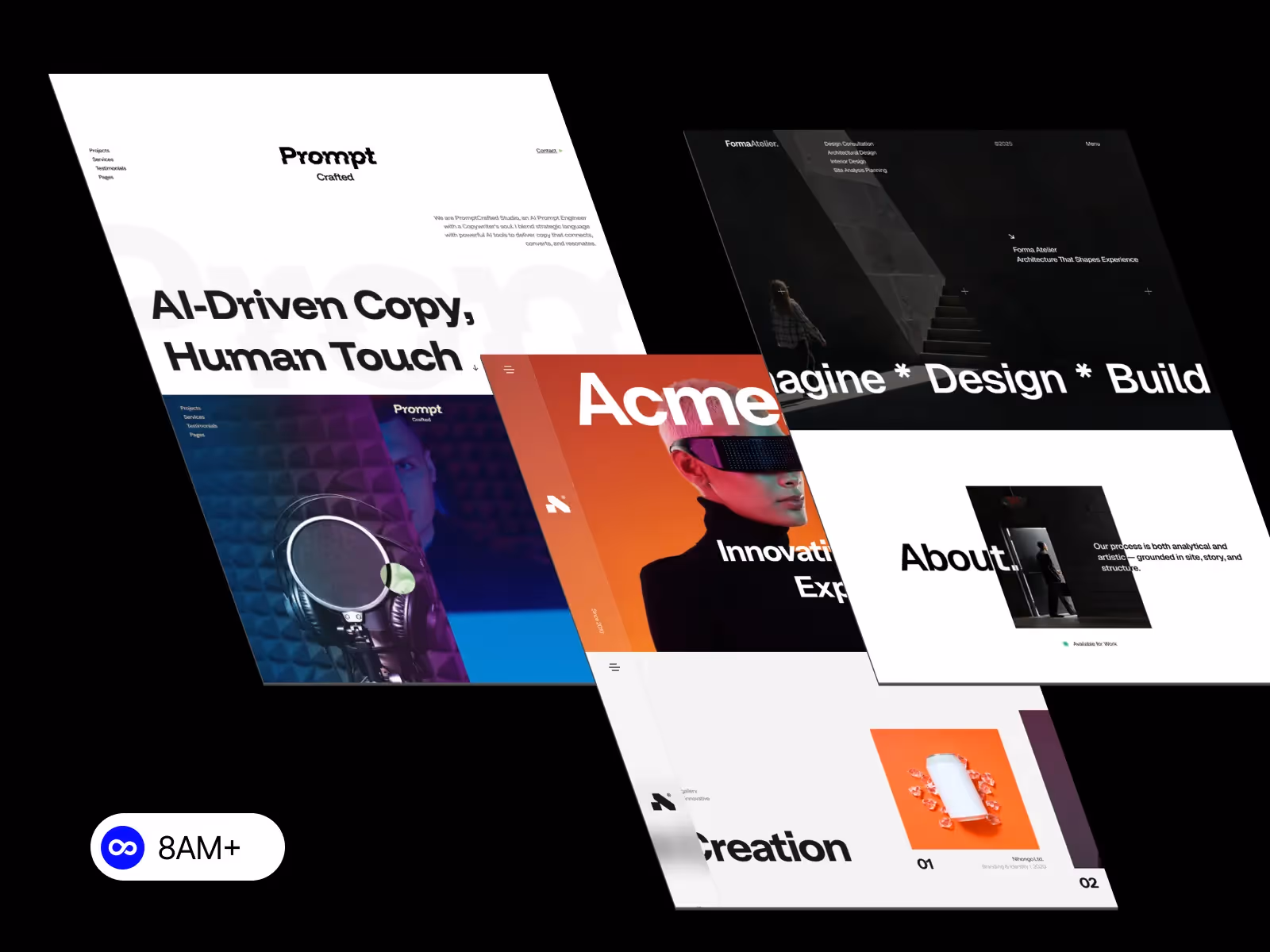
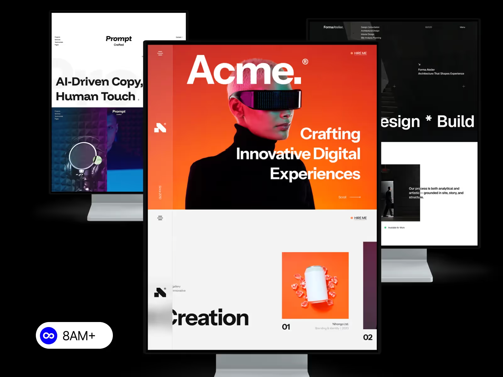
If you don’t want to build from scratch, start with a responsive Webflow template.
All templates from 8am.design are crafted with responsiveness in mind — meaning your website will look perfect on every device right out of the box.
You can still customize layouts, colors, and typography easily using Webflow’s visual editor.
Before hitting publish:
This ensures everything works seamlessly for your real users.
Responsive design isn’t just a trend — it’s a must-have for modern websites. With Webflow’s intuitive interface, you can design, test, and launch responsive sites faster than ever.
Start your journey with a ready-to-launch, fully responsive Webflow template from 8am.design and create a site that looks stunning on every screen.


.svg)
.svg)
.svg)