Understanding Webflow breakpoints is the foundation of building a truly responsive website. Breakpoints control how your design adapts across desktop, tablet, and mobile devices, ensuring your layout remains usable, readable, and visually consistent on every screen size. This guide explains how Webflow breakpoints work, how to design for each device, and best practices to avoid common responsive issues.

Breakpoints in Webflow define screen width ranges where styles change. Webflow automatically generates CSS media queries behind the scenes, allowing you to visually control responsive behavior without writing code.
By default, Webflow provides:
Each smaller breakpoint inherits styles from the larger one unless you override them.
Webflow uses a desktop-first system:
Changes made on a smaller breakpoint do not affect larger breakpoints, but changes on Desktop affect all devices unless overridden.
This cascading system is powerful—but only if you design intentionally.
Desktop is your base layout.
Best practices:
If your desktop layout is overly complex, it will be harder to adapt for mobile.
Tablet is often overlooked—but it’s where many responsive issues appear.
What to check on Tablet:
Tablet layouts should feel intentional, not like a scaled-down desktop.
Mobile Landscape is a transition breakpoint between tablet and mobile portrait.
Best practices:
This breakpoint helps smooth the transition into fully vertical mobile layouts.
Mobile Portrait is the most critical breakpoint.
Focus on:
Best practice in 2026 is to treat mobile portrait as a separate design, not an afterthought.
Avoid these common errors:
Most “broken mobile layouts” come from these mistakes.
Efficient breakpoint management saves time and keeps your site scalable.
Webflow breakpoints are not just technical settings—they’re design decisions. When used correctly, they allow you to craft responsive experiences that feel natural on every device.
By designing intentionally for desktop, tablet, and mobile, you’ll create Webflow websites that are modern, user-friendly, and future-ready.
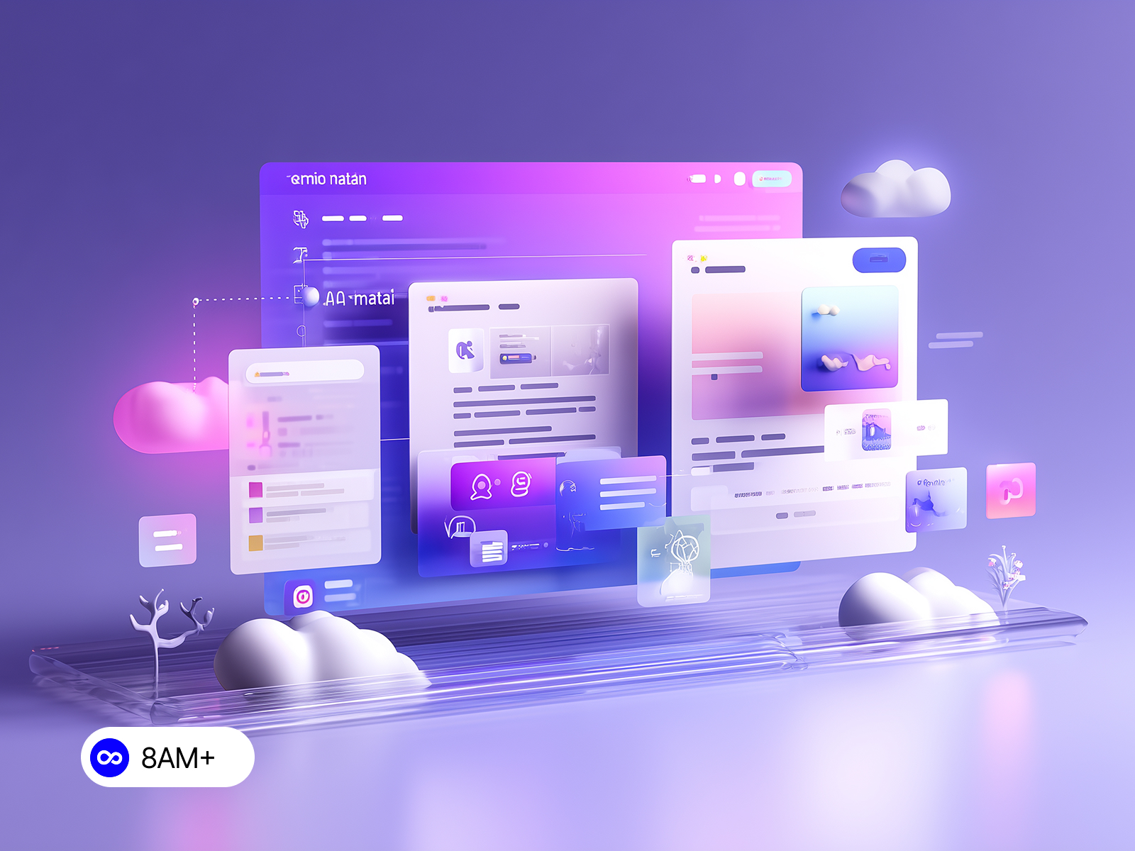
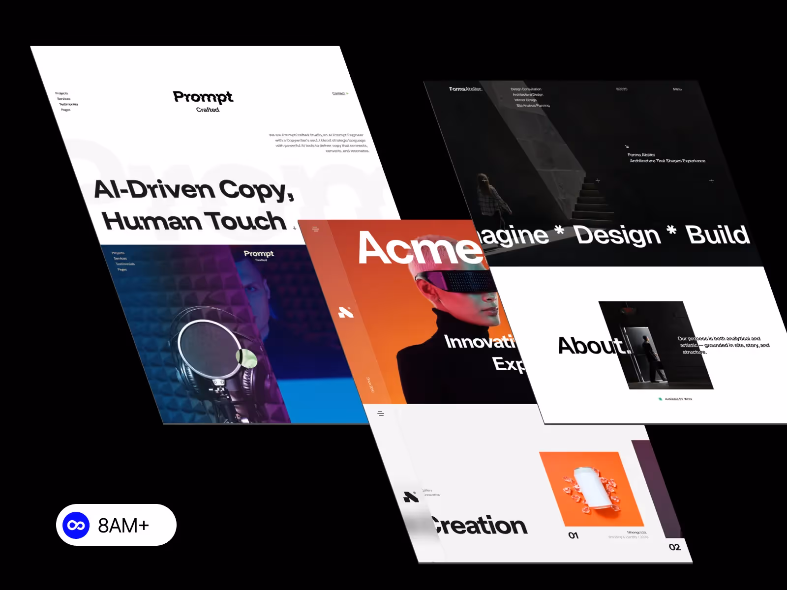
Ready to build a responsive Webflow website without starting from scratch?
Browse professionally crafted, fully responsive Webflow templates at 8am.design and find the perfect solution for your specific needs.


.svg)
.svg)