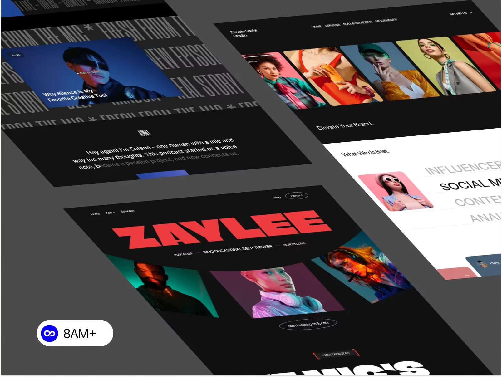
Responsive design is no longer optional—it’s a baseline expectation. In 2026, Webflow responsive design goes beyond simply resizing layouts. It’s about performance, accessibility, SEO, and real-world usability across devices. This guide covers the most important Webflow responsive design best practices you should follow to build future-ready websites.

Although Webflow uses a desktop-first workflow, best practice in 2026 is mobile-conscious design from the start.
What this means:
Designing desktop layouts that can gracefully collapse into mobile saves hours of fixes later.
Responsive Webflow sites rely heavily on Flexbox and Grid, but knowing when to use each is key.
Best practice:
Avoid mixing Flexbox and Grid randomly. A clear layout strategy improves consistency and responsiveness.
One of the most common responsive issues in Webflow comes from fixed sizing.
Instead of:
Use:
This ensures your layout adapts naturally to different screen sizes.
In 2026, responsive design failures usually happen on tablet and mobile, not desktop.
Best practices:
Never rely solely on inherited styles. Each breakpoint deserves intentional design.
Typography is a major UX and SEO factor.
Recommended practices:
Clear, readable typography improves engagement and reduces bounce rates.
Placeholder text hides responsive problems.
In 2026, best practice is to:
This helps prevent broken layouts after launch.
Spacing that works on desktop often feels excessive on mobile.
Best practice:
Balanced spacing improves both usability and perceived quality.
Images are a common cause of mobile issues.
Follow these rules:
Responsive images improve performance and prevent layout overflow.
Before publishing any Webflow site:
A final responsive review is a non-negotiable step in 2026.
Modern responsive design is also about speed.
Best practices include:
Performance directly impacts SEO and user experience.
Webflow responsive design best practices in 2026 are about clarity, flexibility, and intent. By focusing on structure, layout systems, breakpoints, and performance, you can build responsive Webflow websites that feel modern, fast, and professional—on any device.
Ready to launch a responsive Webflow website without starting from zero?
Browse professionally crafted, fully responsive Webflow templates at 8am.design and find the perfect solution for your specific needs.

