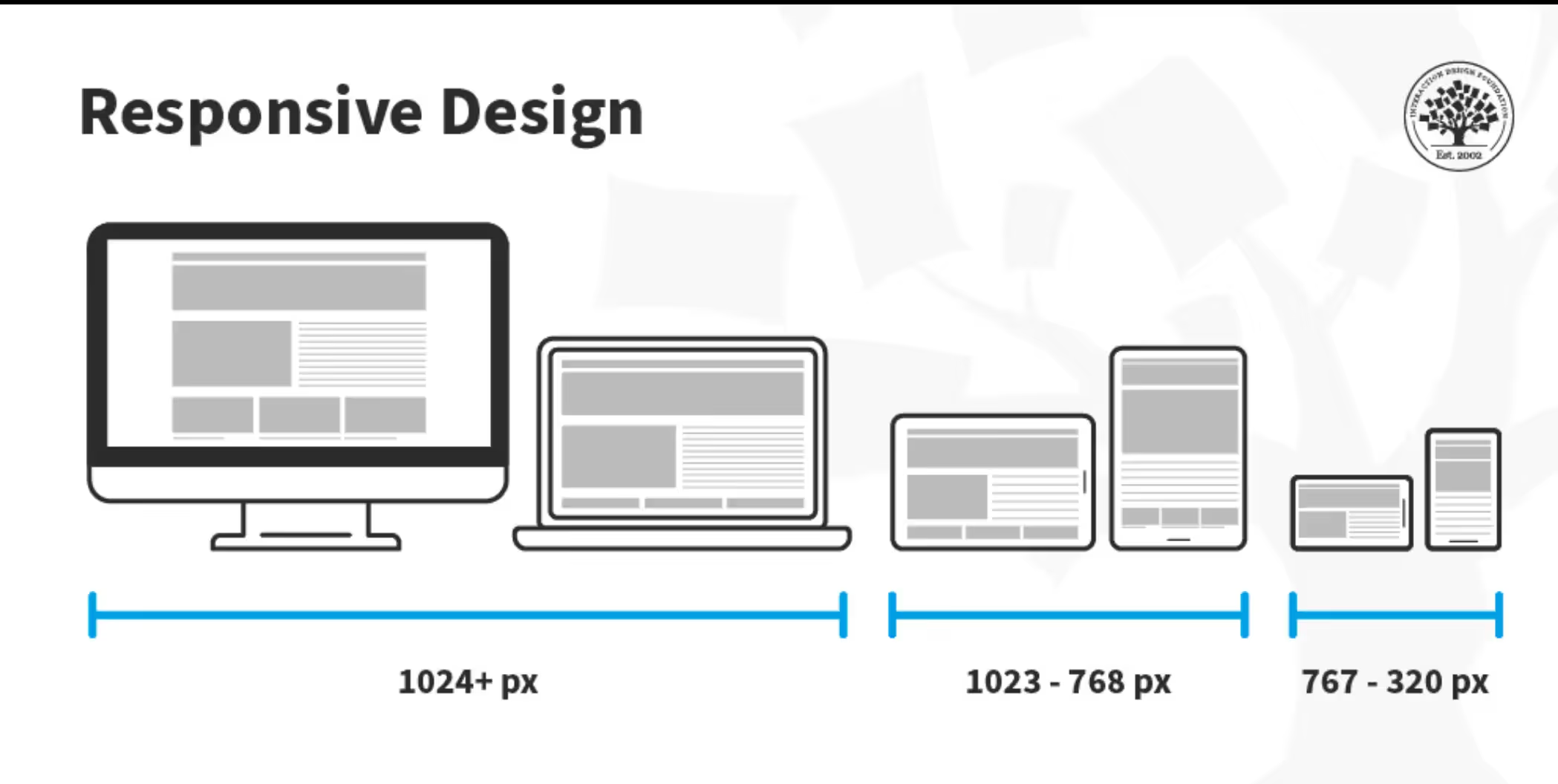
Responsive design is essential for modern websites, but there are two very different ways to achieve it: Webflow responsive design and traditional CSS media queries. Both approaches solve the same problem—adapting layouts across devices—but they differ greatly in workflow, flexibility, and who they are best suited for. This article breaks down the differences so you can choose the right approach for your project.
Traditional responsive design relies on CSS media queries to apply styles based on screen size.
Example conceptually:
This approach gives developers full control but requires:
Media queries are powerful, but they can become complex and time-consuming as projects grow.

Webflow responsive design abstracts CSS media queries into a visual breakpoint system. Instead of writing code, designers adjust layouts directly inside the Webflow Designer.
Behind the scenes, Webflow still generates clean HTML and CSS media queries automatically. The difference is how you interact with them.
Webflow allows you to:

Webflow dramatically speeds up iteration and reduces trial-and-error.
Webflow lowers the barrier to professional responsive design.
Webflow is ideal for fast-moving teams and startups.
For most business websites, Webflow’s flexibility is more than enough.
Webflow reduces technical debt over time.
Traditional CSS media queries may be better when:
Developers with strong CSS skills may prefer this approach.
Webflow is ideal when:
For marketing sites, portfolios, landing pages, and business websites, Webflow often provides a better balance of power and efficiency.
Yes. Webflow allows custom CSS and JavaScript when needed, giving advanced users the option to extend functionality while still benefiting from visual responsive controls.
Webflow responsive design and traditional CSS media queries achieve the same goal—but through very different experiences. CSS media queries offer maximum control for developers, while Webflow delivers speed, clarity, and accessibility for modern teams.
Choosing the right approach depends on your project’s complexity, timeline, and who is building the site.
Want the benefits of responsive design without writing complex code?
Browse professionally crafted, fully responsive Webflow templates at 8am.design and find the perfect solution for your specific needs.


.svg)
.svg)
.svg)